My Role:
UX/UI Designer, Team Lead
UX Research, Content Audit, Information Architecture, Visual Design, Prototyping, Usability Testing
Team Size:
2 Designers
Year:
Jul 2025- Aug 2025
Tools:
Figma, Adobe Creative Suite
LOCVM is a healthcare staffing platform that connects locum physicians with medical facilities seeking temporary coverage. The platform had completed its initial product launch but was experiencing low conversion rates and engagement issues across key user flows.
The UX team identified five critical pain points from weak landing page messaging to unclear job discovery and missing personalization that were preventing users from successfully navigating the platform. The goal is to improve user conversion, enhance personalization, and clarify the job search experience to better serve both healthcare professionals and recruiters.
Final design
The client immediately implemented home page redesign, onboarding flow, job cards, and tracking dashboard. These high-impact improvements directly addressed user conversion and engagement. Additional enhancements including navigation updates and reviews section were included in the product roadmap. We received positive feedback on the clarity and user-centered approach of the redesign.


Explore more on locvm!
I led the design solutions across the entire user journey, including home page, about page, onboarding to improve conversion and engagement.
Research & Redesign
Our research methodology combined quantitative surveys and qualitative usability testing to understand user pain points and validate design solutions.
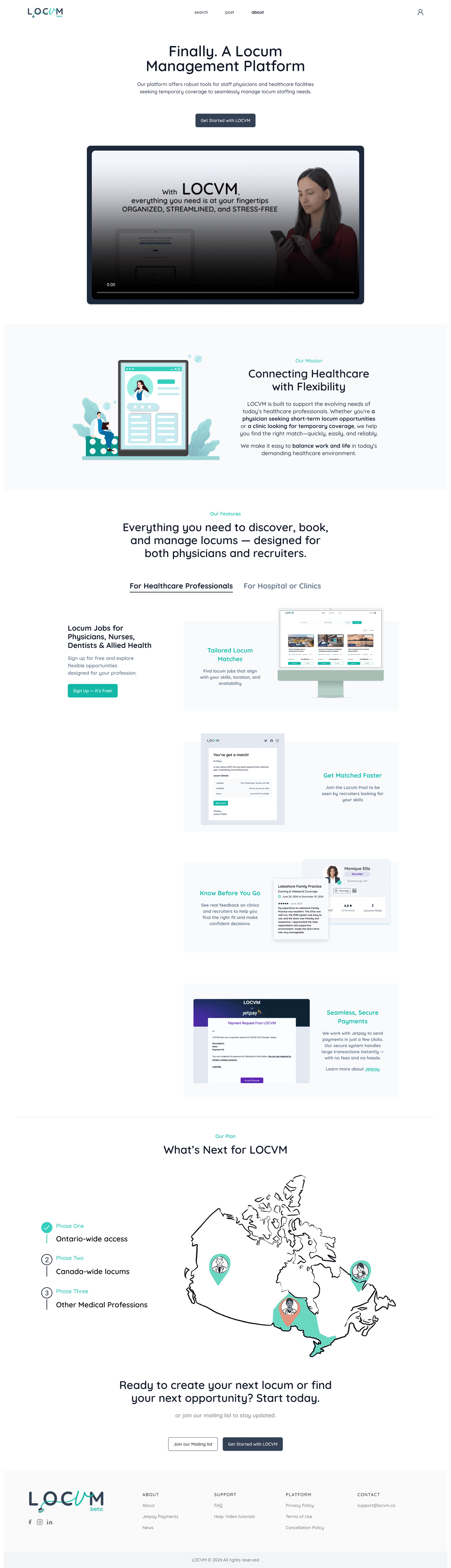
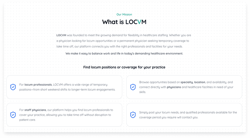
Home & About weren’t helping new users convert
Social media traffic often lands on the About page, with weak or hidden CTAs, leading to higher bounce rates and lower conversions
Home page jumps straight to listings without explaining what Locvm is or who it’s for
UI/UX gaps and lack human elements that build trust
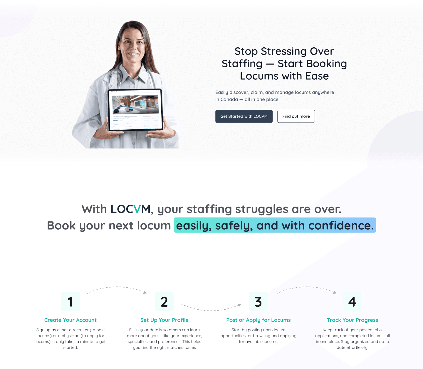
Redesign - Home Page
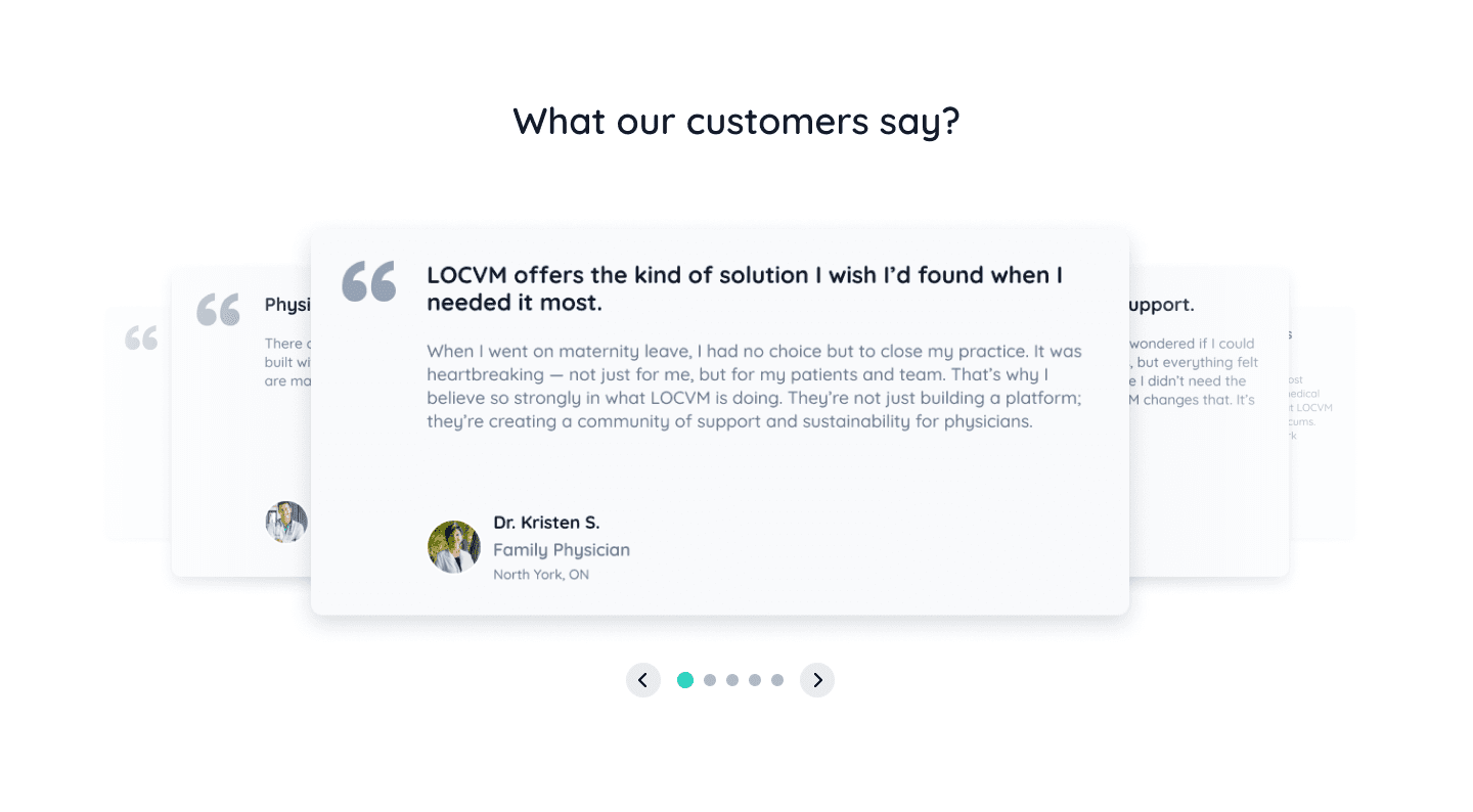
The home page now features a hero section with clear title and messaging plus a prominent CTA. Below that, a short 4-step summary explains how LOCVM works, followed by testimonials from real users to build trust and credibility.
Redesign - About Page
Previously, the About page had detailed and sometimes repetitive content. The features were mixed into the mission section without clear separation, making it harder for visitors to quickly scan the page and understand what we offer.
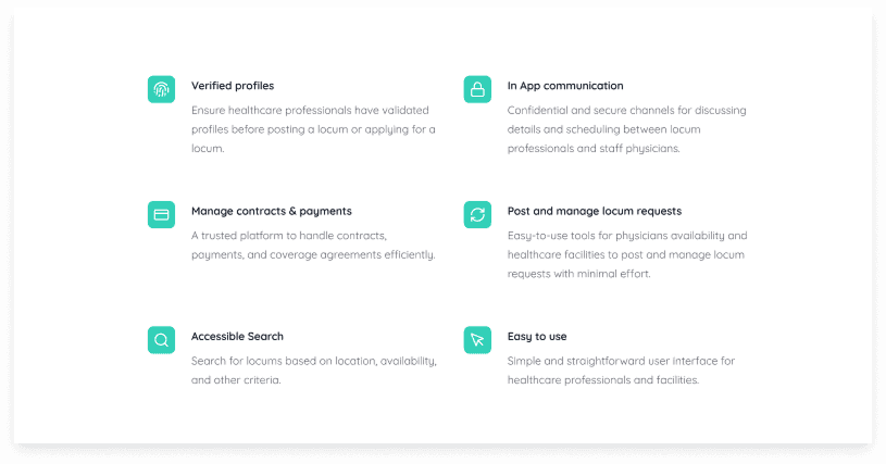
The About page was cleaned up with improved layout and content to make it more engaging. The new structure groups features by user type for clarity, and we added a bottom CTA to encourage sign-ups.
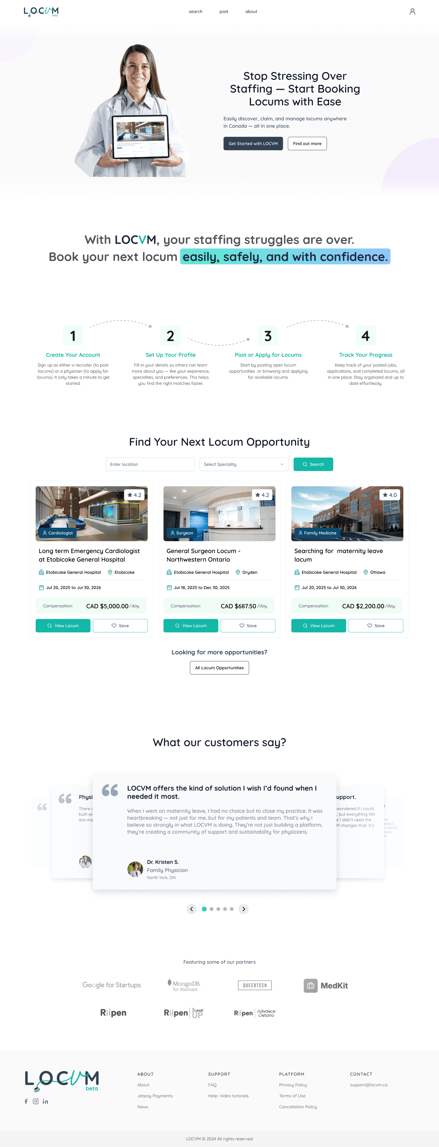
Post-Login Experience Lacks Personalization and Clarity
Same interface used for different user types, leading to irrelevant content and features for certain users → creates confusion about what actions are available or applicable
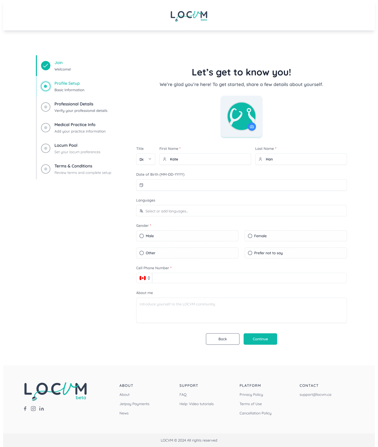
No onboarding flow to tailor the experience; long forms and unclear steps may cause users to abandon sign-up
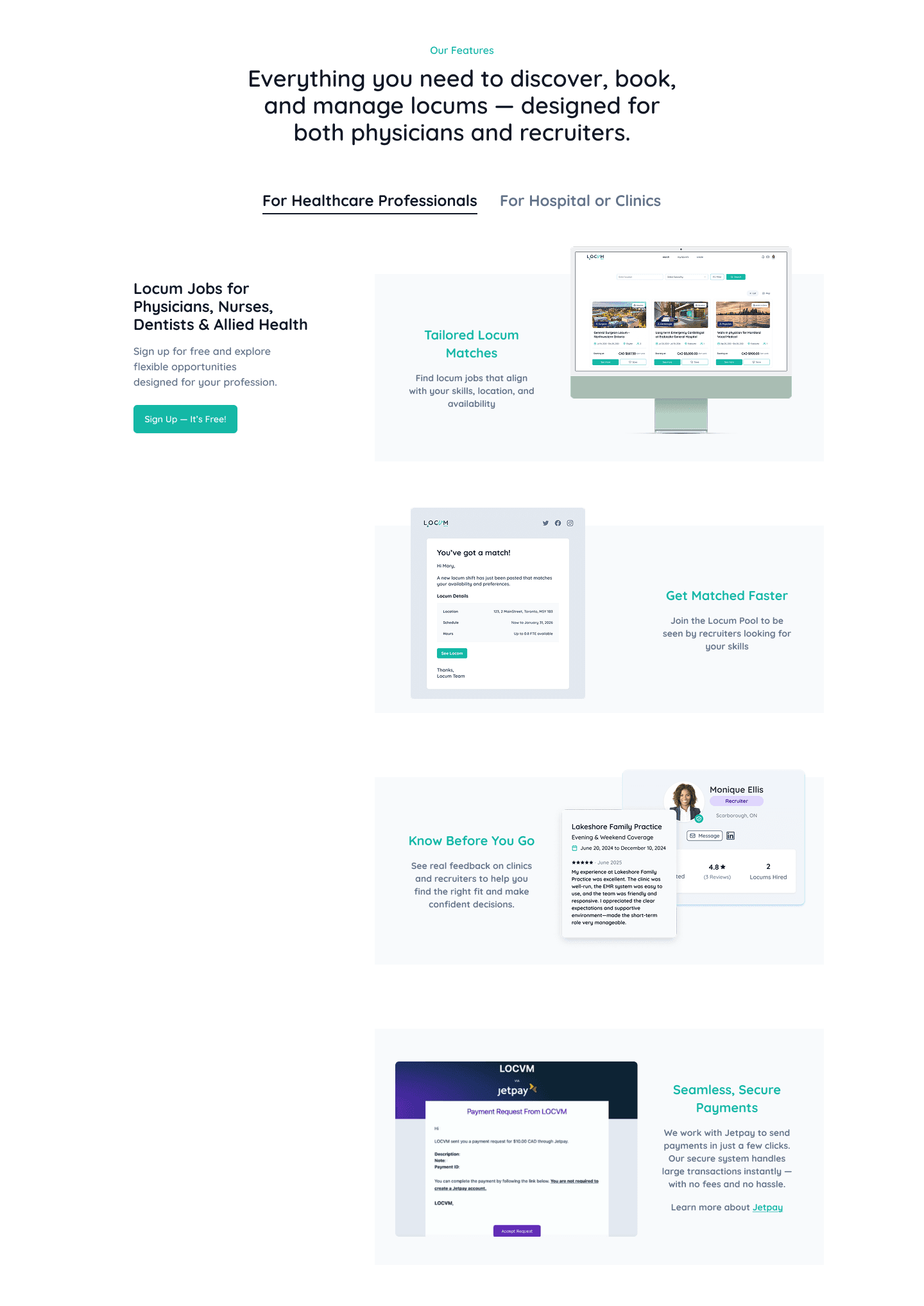
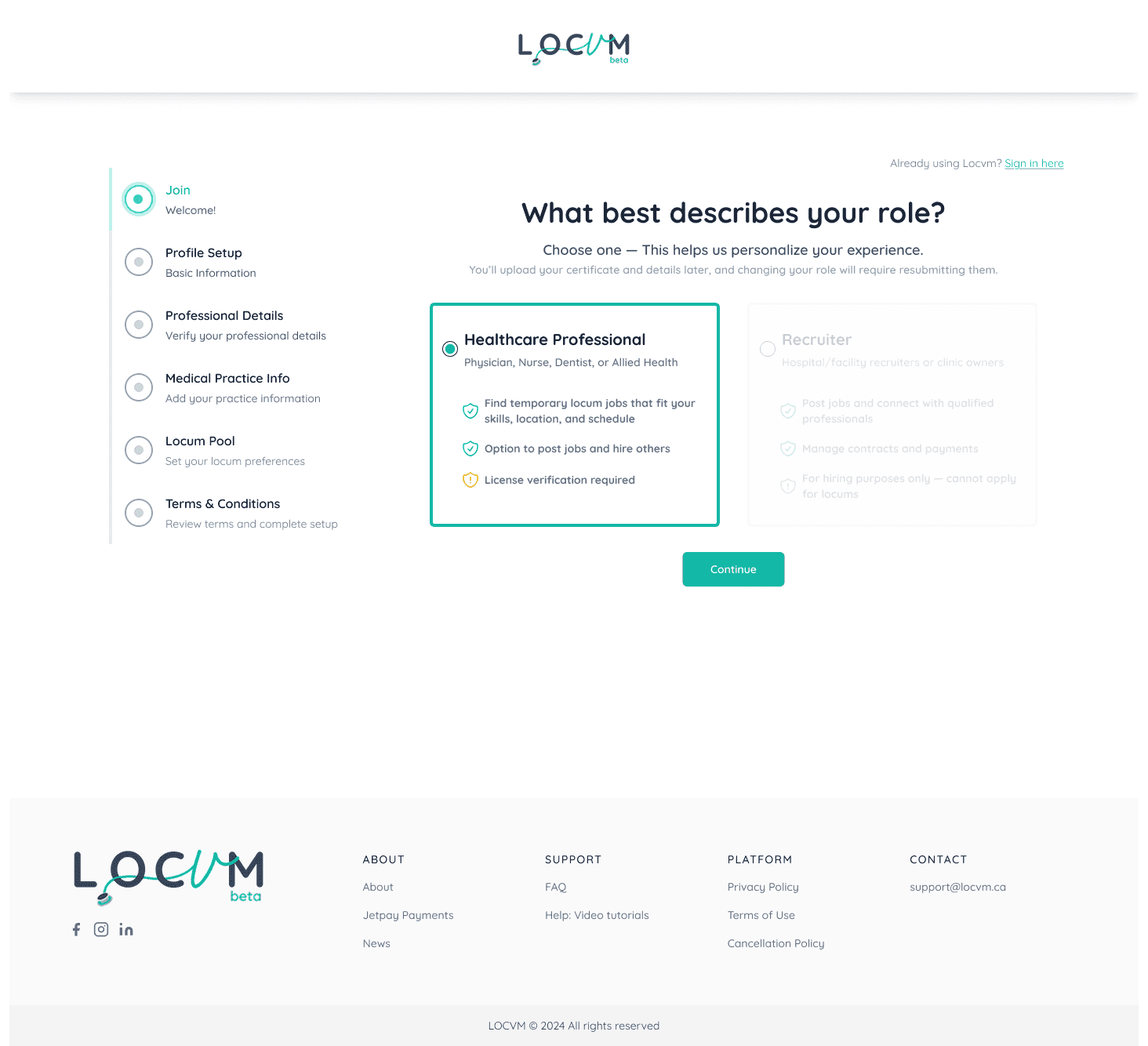
Redesign - Onboarding Process
Introduced an onboarding process with a clear progress bar to reduce cognitive load and make information entry easier and faster. Different page layouts were outlined for different user types to ensure each user sees the most relevant content and features.
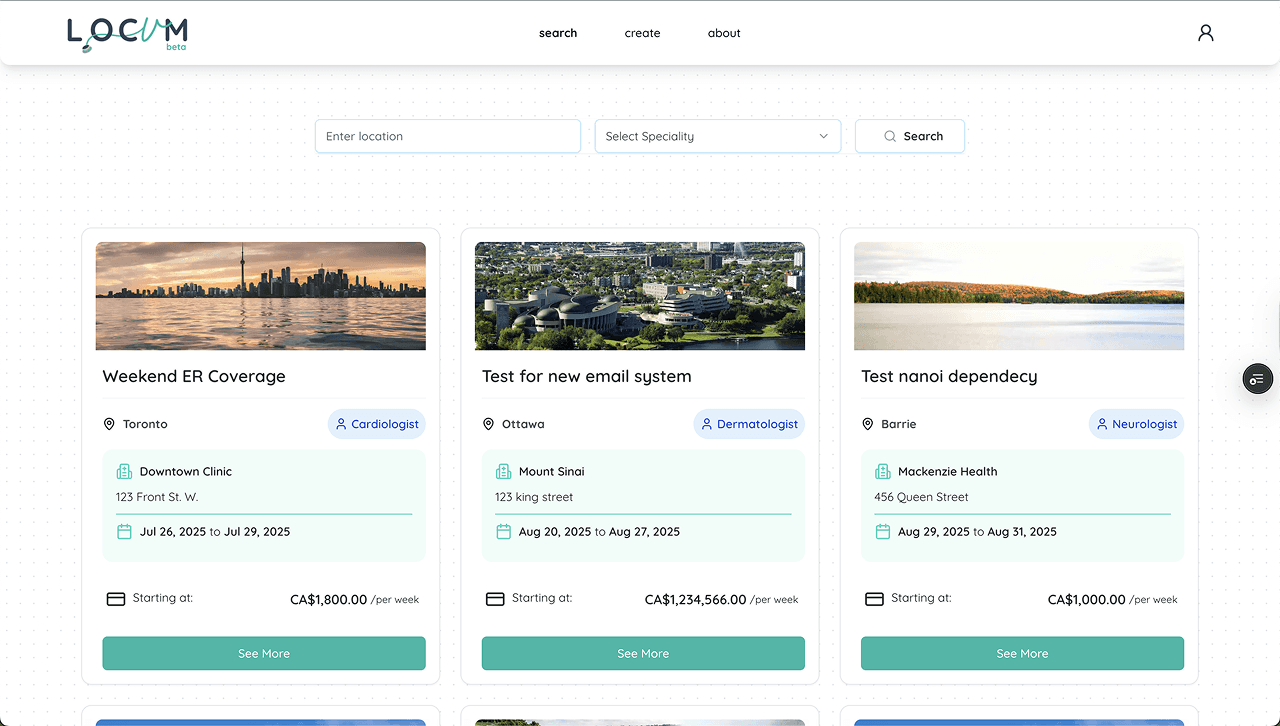
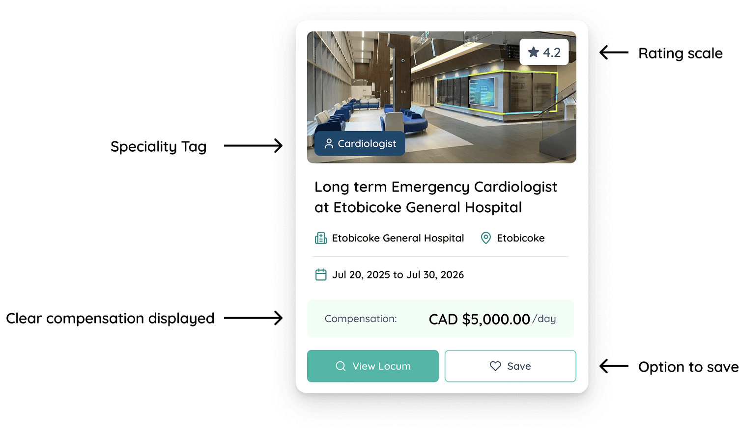
Pain Point 3
Unclear Job Cards and Missing Filters
Redesign - Onboarding Process
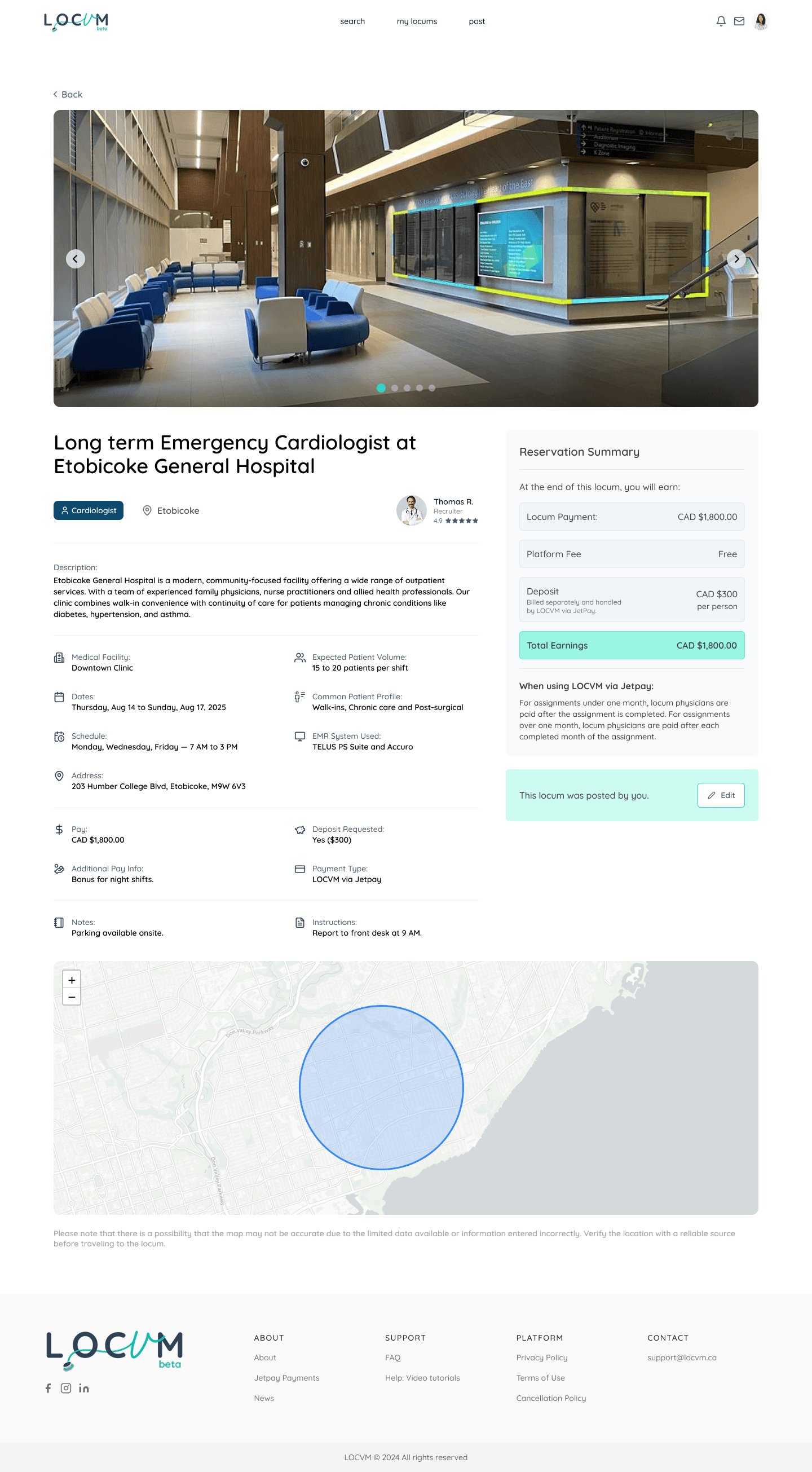
The redesigned job card features a clear information hierarchy with a specialty tag, facility rating, and prominent compensation display. Job details including title, hospital, location, and dates are organized logically, with easy options to view the full posting or save for later.
Other Major Redesigns
I used a palette of bright, inviting colors and clean, geometric shapes to create a casual and approachable atmosphere, providing a comfortable environment for conversations.
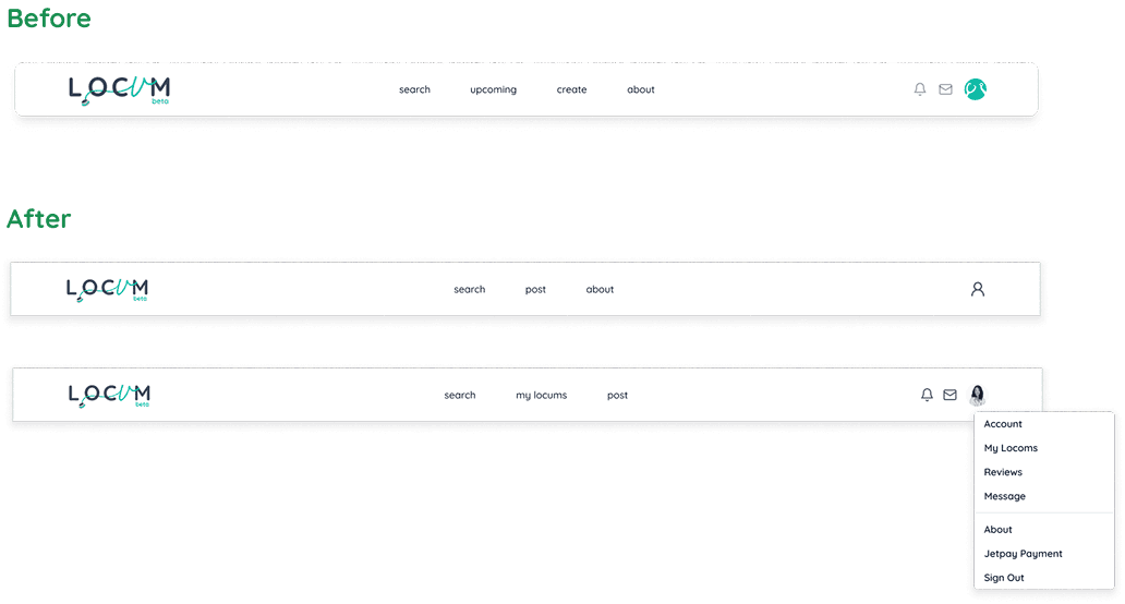
Major Improvement #1
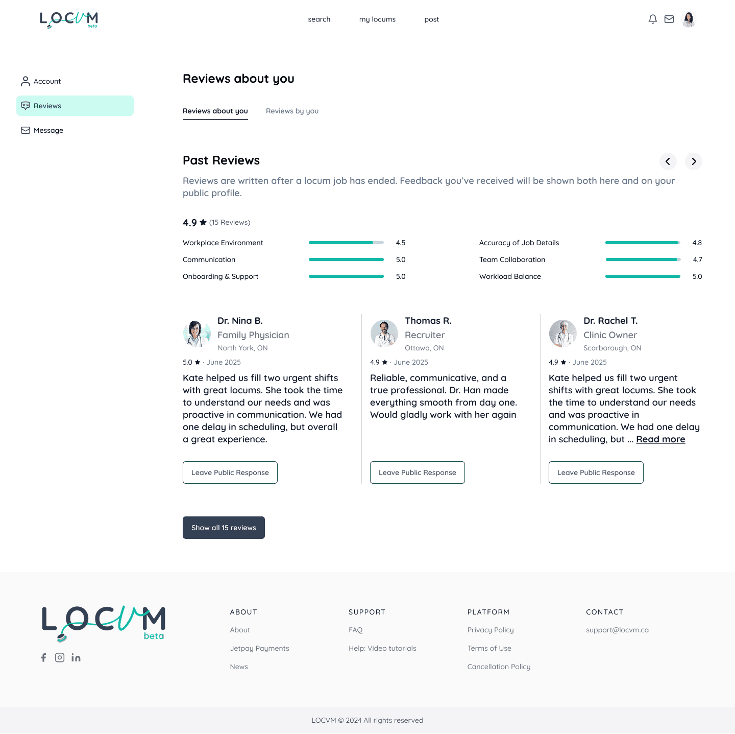
The navigation bar is not consistent across different pages. We updated it and reorganized the content of the dropdown
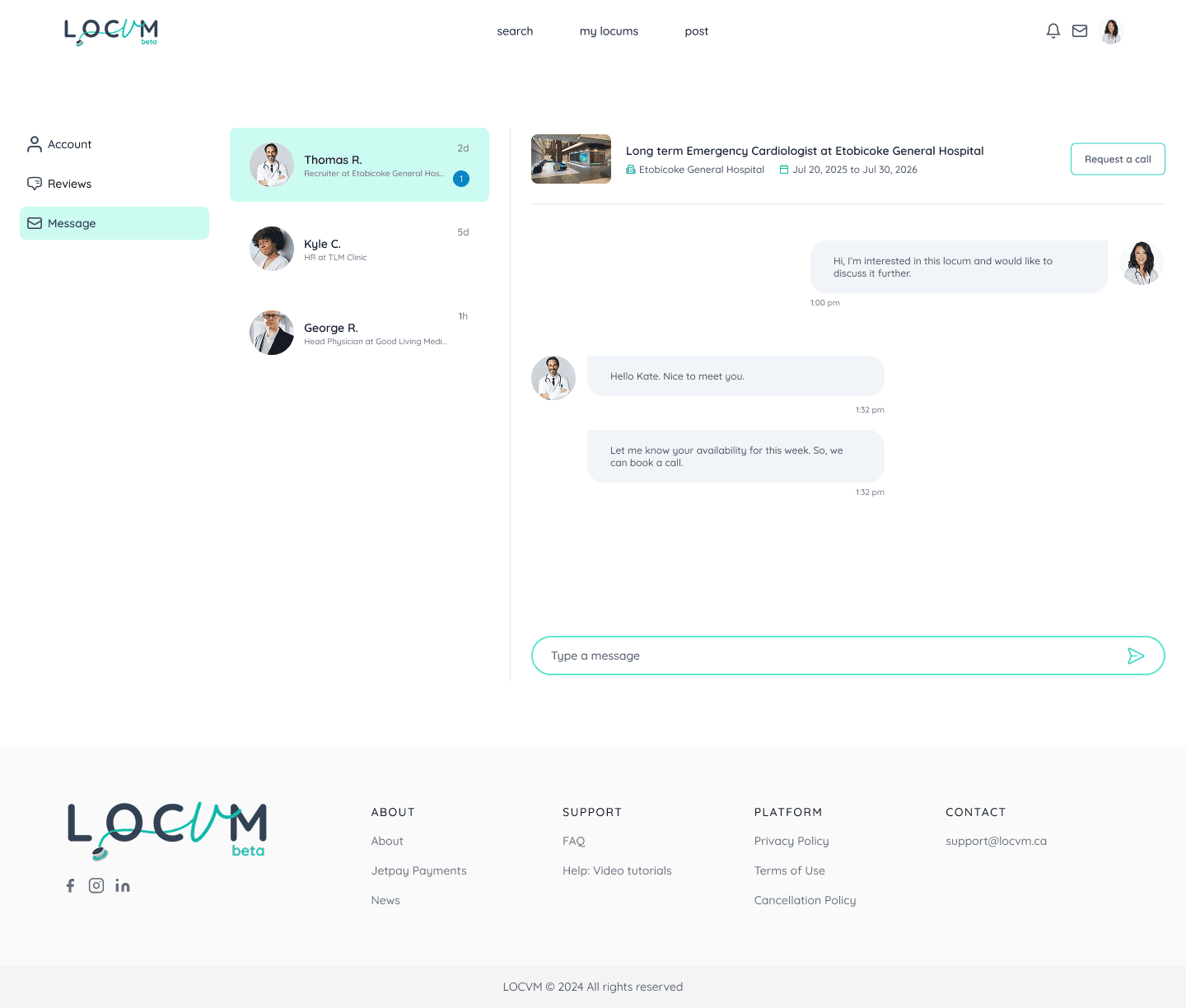
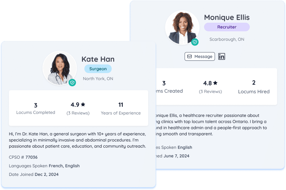
Major Improvement #2
Profile cards were updated with a cleaner layout that integrates reviews and improves content hierarchy. Key metrics like locums completed, ratings, and experience are prominently displayed alongside professional information, bios, and action buttons for messaging and outreach.
Major Improvement #3
A reviews section was designed based on survey results to help users make informed decisions. Further research is planned to assess the impact of ratings on user experience.

Reflection & Learning
This project reinforced the power of systematic user research in identifying and solving complex problems. By focusing on critical pain points—weak user conversion on landing pages, lack of personalization in onboarding, and unclear job discovery—we were able to prioritize solutions that had the most impact.
A key learning was how personalization through role-based experiences significantly improves usability. When users felt the platform was built for their specific needs rather than forcing them into a one-size-fits-all experience, they were more likely to complete critical actions like onboarding and job applications.
I also learned the importance of clear information architecture and progressive disclosure. By breaking down overwhelming forms and dashboards into logical sections with clear progress indicators, we reduced cognitive load and made the platform feel more approachable.
This experience taught me how to balance design research with execution within tight timelines, and how to communicate design rationale clearly so the client could implement solutions confidently after the project concluded.
